Quantcast
Channel: Refreshing News
Viewing all articles
Browse latest Browse all 6389

This Is What The World Looks When Countries Are Scaled By Population Size

$
0
0


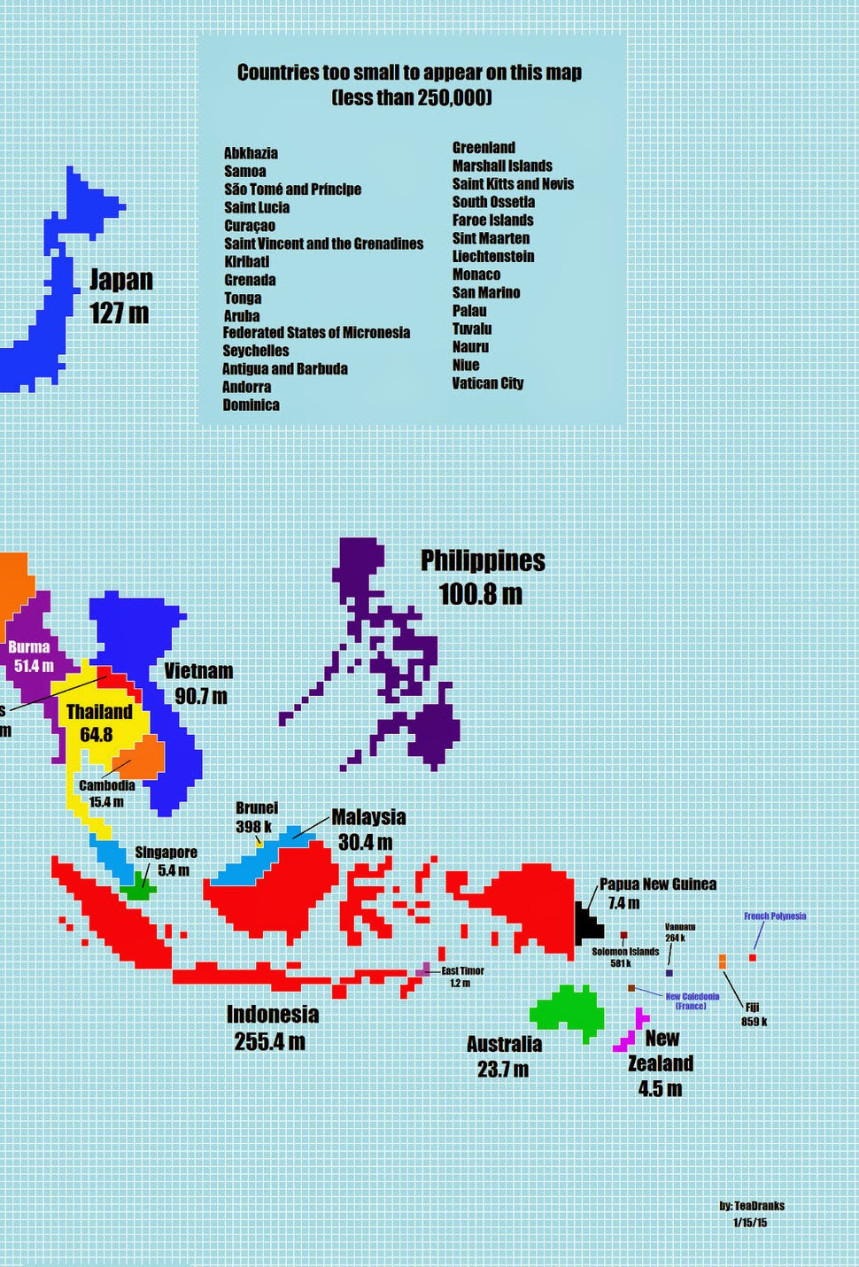
In this cartogram made by Redditer TeaDranks, each country's size is determined by population instead of geographic area. 

Some things look fairly familiar...

Except Canada is now a thin, jagged line.

While others don't...
India now takes up a massive amount of space.  Both Australia and Denmark have almost disappeared, and China now dwarfs Russia instead of vice versa.

"I was inspired by this map which is now ten years old," said TeaDranks. Interesting note: The new map's scale is twice as large as the old one's.


Viewing all articles
Browse latest Browse all 6389

Trending Articles


<script src="https://jsc.adskeeper.com/r/s/rssing.com.1596347.js" async> </script>